Travel Time Visualizations for the World
01.11.2010
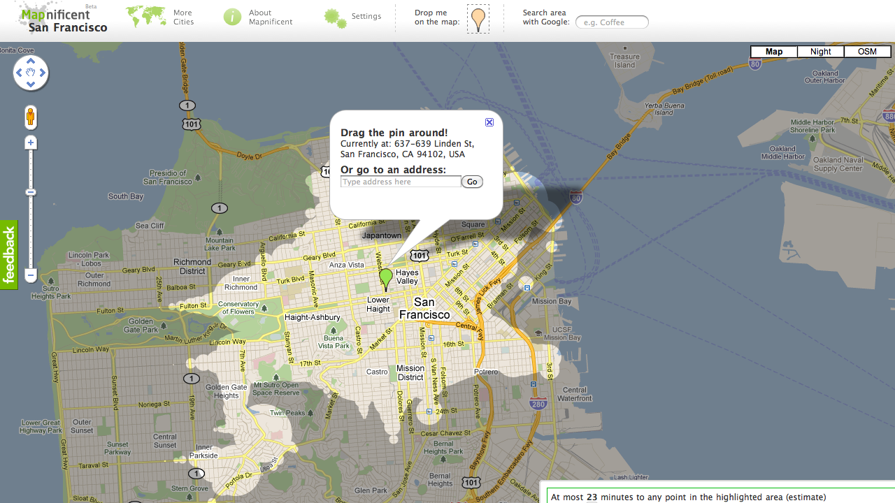
Mapnificent provides dynamic public transport travel time maps for more than 70 cities world wide.
Mapnificent started with the wish to have a Mapumental for Berlin and the name Mapnificent is a clear hommage to the mysociety project. After some moderately successful experiments (brute-force! scraping!) I launched a Mapnificent version that works with GTFS data and was therefore able to provide travel time visualizations for many cities around the world.
The coolest thing about Mapnificent is that it calculates travel time in the browser by fetching all necessary data and then computing it in a Web Worker. Mapnificent needs a rewrite soon to keep it up with browser developments.
Now and then, I add another city that just started publishing GTFS data. Over the years I have connected with many people around the world who are as passionate about public transport as I am.
An interesting aspect of Mapnificent that I’d like to explore further is analyzing the evolution of public transport systems and comparing schedules. Urban planners, activists and journalists have approached me about this. Take this older schedule for New Orleans RTA and compare it to the latest version. You can clearly see that you can go further in the same amount of time.